One Time Payments
Company: Charter Communications
Product: My Spectrum Mobile App
Role: Design and Strategy Lead
In 2019 we noticed that performance metrics for the app were showing a high number of duplicate payments, payments that were canceled right after they were made, and calls to customer service right after a customer made a payment on the app. Knowing these things we started combing through app and play store feedback looking for bad reviews that correlated with payment issues. There was a noticeable trend of customers complaining that they didn’t know how much they paid or if their payment even went through. This explained some of the issues that we saw in the performance metrics.
We now had a clear idea of a problem and its cause, so our goal was to solve it through better design.
Process
Research
With the help of a research analyst we did comprehensive benchmarking of payment flows in other apps. An immediate take away was most highly rated apps that were focused on bill pay utilized a multi-step flow. Our bill pay flow was completed on one screen, a design decision we inherited from an earlier version of the app. Diving deeper into this, we found more app and play store verbatims that pointed towards the idea that users did not know the pre-populated fields on the bill pay section of the app were editable.
Hypothesis
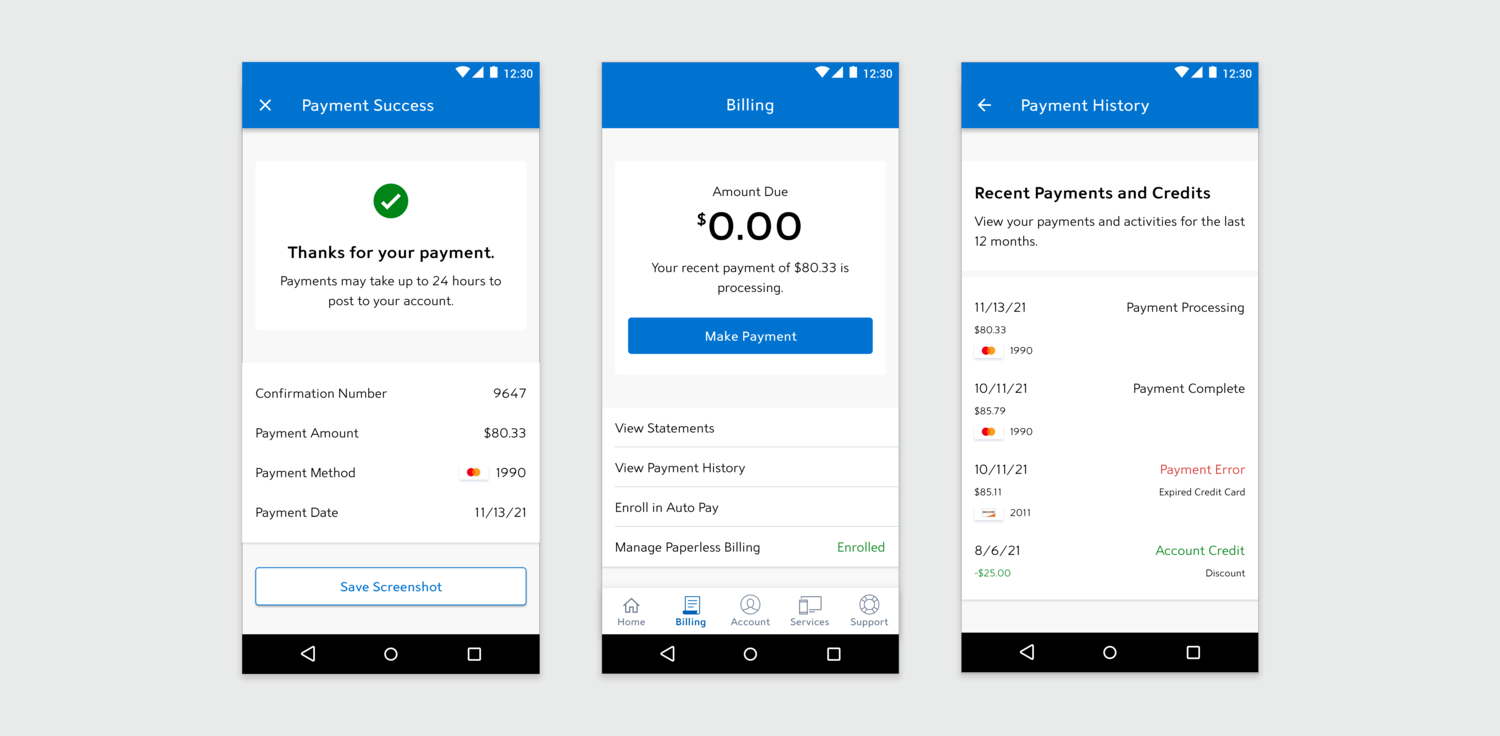
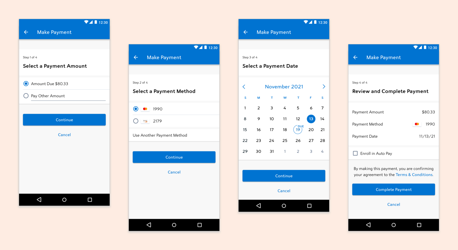
Our hypothesis was that by redesigning the bill pay flow to be four steps on four screens ( instead of one screen) we could reduce the number of one time payment issues. On top of shifting toward a multi-step flow, we thought adding an option to screenshot your payment confirmation could help with the technical limitation of not being able to show billing history in the app.
UX Design
This phase focused on balancing desirability, feasibility, and viability. To gain a better understanding of backend limitations, biller nuances, and future service considerations, we met regularly with the feature’s business owner outside of typical stakeholder reviews. We sketched out initial flows and wireframes in collaborative whiteboarding session. I then formally documented these ideas in user flows and annotated wireframes that outlined functionality and structure that were reviewed by stakeholders and development teams.
UI Design
After high-level flows and wireframes were reviewed, I worked side-by-side with a UI designer as she composed high fidelity concepts and prototypes to share with stakeholders. We socialized designs with the broader design team, including accessibility, design systems, as well as designers who worked on the same feature, but for web. After initial iteration based on internal feedback, we worked with a research analyst to put our concepts through design validation.
Development
Our reviews throughout the process had a development presence, which helped inform design decisions. We delivered the completed UI comps, UI flows, a copy deck, and a prototype that product owners used to write stories from and link to in acceptance criteria. I attended the development teams’ various agile ceremonies and answered questions or provided design iterations, and made sure that the built experience matched designs and design intent.
Results
Key Accomplishments
- Launched a refined, intuitive redesign of the highest used feature on the app.
- Listened to customers to design an overall better experience that also met business goals.
- Updated the feature to current design system standards.
- Introduced new, valued functionality for the app to save a screenshot at the tap of a button after a successful payment.
Challenges Met
- Gained buy-in to overhaul the experience of this feature.
- Designed within the constraints of disparate billing systems in legacy customer footprints that limited certain functionality across experiences.
- Updated the feature to current design system standards.
- Busted the myth of the three-click rule.
App Store Ratings
- ★★★★★
“This is great. Much better. Love the screenshots option.” - Play Store, 1/20 - ★★★★☆
“Just got it, I'll know more in a few months and rate it again, everything went smoothly, took my payment, made a screenshot for my records, so far, so good!” - Play Store, 1/20 - ★★★★★
“Fast and easy way to pay bill” - App Store, 1/20 - ★★★★★
“I like the layout of the payment screens now. Plus the option of saving a screenshot to my photos. Nice update!” - Play Store, 12/19 - ★★★★★
“So much easier to pay your bill on the app than over the phone. Glad I downloaded.” - App Store, 11/19